
Autumn Pastel Tips: Capturing the Season's Beauty
- Joan Lawson

- Nov 4, 2025
- 4 min read
Updated: Feb 5
After my last studio update, I thought it might be nice to follow up with some autumn pastel tips. The colours outside the studio door have deepened into that familiar, fleeting mix of golds, russets, and soft greys. It’s a season I always find inspiring — full of subtle light and rich contrasts. Pastel is the perfect medium to respond quickly to it before everything fades into winter.
Have a read, get inspired, and then have a go at my Autumn Art Competition here in the Drawing Challenge Group.
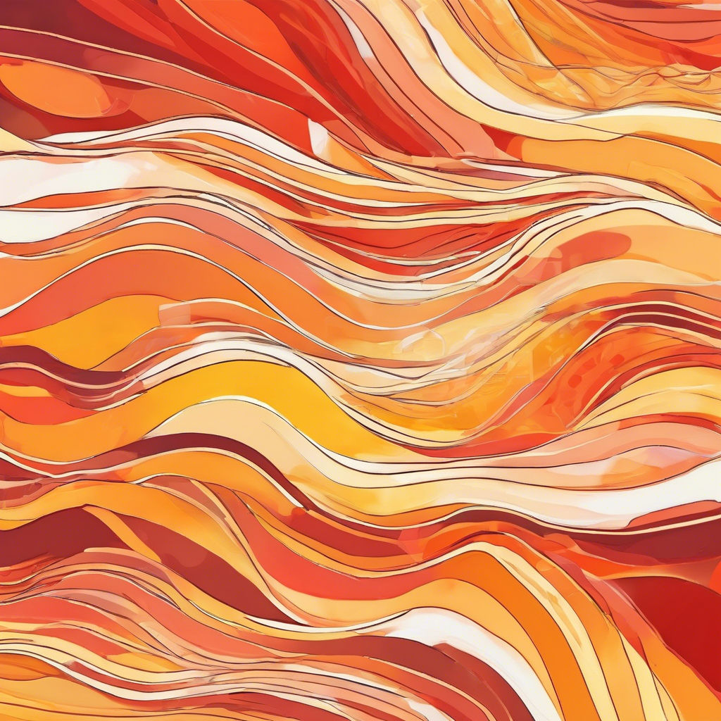
Embracing Autumn's Colour and Mood
Autumn invites a slower, more contemplative approach. The light is lower, shadows are longer, and colours seem to hum rather than shout. When starting an autumn piece, I often pull out a limited selection of warm earths, ochres, and muted violets. I then add just a few bright accents — maybe a golden yellow or a scarlet red — to lift the harmony.
Try building your palette around a few related hues rather than grabbing every colour you see outside. For example, a soft greyed green will make a warm orange sing, while a violet underlayer can give surprising depth to golden leaves. Autumn colour is rarely flat or literal; it’s about suggestion, atmosphere, and how light moves through the landscape.
Choosing Your Surface for Pastel Work
A good surface makes all the difference, especially when you want to layer and blend. I’ve been using Pastelmat and Canson Mi-Teintes Touch recently. Both have enough texture to hold multiple layers without becoming muddy. For smaller, looser sketches, a toned paper such as sienna or warm grey provides an instant sense of mood before you’ve even begun.
If you tend to overwork your pastels (and most of us do!), try limiting yourself to just three or four layers. That gentle restraint can actually help you capture the freshness and spontaneity of the season.
Techniques for Autumn Textures
This is where pastel really shines. A few strokes can suggest an entire woodland if you vary pressure, direction, and edge quality.
Scumbling: Lightly dragging a stick of pale colour over a darker layer can mimic mist, sunlight through leaves, or distant fields.
Broken colour: Allow two or three colours to sit side by side without blending. This keeps the energy alive and gives that lovely shimmering effect you often see in autumn foliage.
Blending: I use it sparingly, usually just with the side of my little finger or a bit of kitchen towel. This softens distant areas and keeps the focus on crisper details in the foreground.
Mark-making: Don’t underestimate the expressive power of varied strokes. A quick flick can describe a twig, while a heavier, diagonal sweep might suggest a gust of wind moving through trees.
Understanding Light and Atmosphere in Autumn
The challenge of autumn light is also its gift. On grey days, everything becomes soft-edged and tonal. On bright ones, there’s a fleeting glow before the sun dips. Try to decide early whether your painting is about light or shadow, and simplify your values accordingly.
One trick I use is to lightly sketch in a warm underpainting (a thin wash of ochre or burnt sienna) before adding pastel. It gives a subtle warmth that shows through the cooler layers and helps unify the painting.
Finishing Touches: Less is More
Less is often more at the end stage. Step back frequently and resist the urge to “fix” every detail. The looser marks are usually the ones that carry the most life. I rarely use fixative except for a very light spray between early layers; it can dull the brightness if overdone.
When framing or photographing your pastel, take advantage of soft natural light — the same light that inspired the piece in the first place. A gentle sidelight will reveal texture beautifully without harsh reflections.
A Note from the Studio: The Joy of Pastel
Pastel is such an immediate, tactile medium. It suits the fleeting nature of autumn perfectly. I’ve been experimenting with small studies on coloured paper as warm-ups for larger work, and they’ve been a joy to do. If you’re inspired to try your own autumn pastels, I’d love to see them. You can share them in the forum on my website (in the Drawing Challenge group for a chance to win a set of brushes) or tag me on social media @joanlawsonart too.
There’s something grounding about working with your hands at this time of year. Watching the seasons turn and letting colour and texture lead the way is a rewarding experience. Whether you’re standing in the landscape or tucked up in the studio, pastel can help you hold on to a bit of autumn’s warmth long after the last leaves fall. Enjoy!
Additional Tips for Autumn Pastels
Experiment with Different Techniques
Autumn is a time of change, and your art should reflect that. Don't hesitate to experiment with different techniques. Try layering different mediums with your pastels. For example, you can use watercolour as a base and then apply pastels on top for added texture.
Explore Different Subjects
While landscapes are a popular choice for autumn pastels, consider exploring other subjects. Still life compositions featuring autumn fruits or flowers can also be beautiful. This approach allows you to play with colour and texture in a different context.
Join a Community
Engaging with a community can enhance your artistic journey. Join local art groups or online forums where you can share your work and receive feedback. This interaction can provide new insights and inspiration.
Keep a Sketchbook
Maintaining a sketchbook is an excellent way to document your observations throughout the autumn season. Sketching outdoors can help you capture the essence of the season and refine your skills.
Conclusion: Embrace the Season
Autumn is a magical time for artists. The colours, light, and atmosphere provide endless inspiration. Embrace the season and let it guide your creativity. Remember, the journey of creating art is just as important as the final piece. Enjoy every moment of your artistic exploration this autumn!

Comments